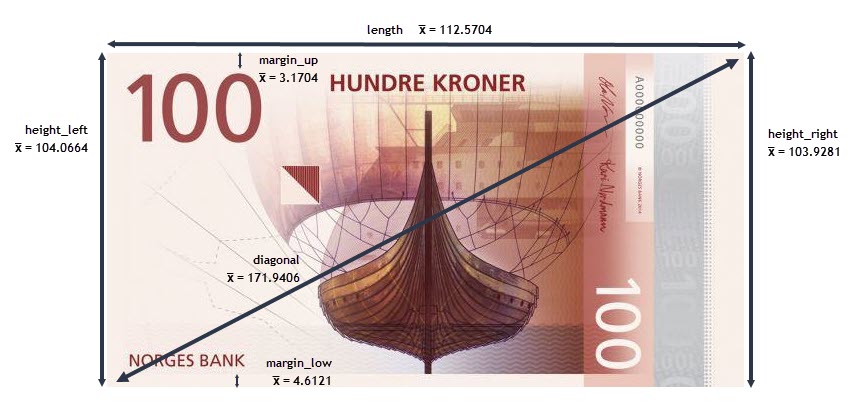
On peut schématiser les 6 longueurs de la façon suivante :
# importation des différents modules
import statistics
import seaborn as sns
import matplotlib
import matplotlib.patches as mpatches
import matplotlib.ticker as mtick
import matplotlib.pylab as pylab
import matplotlib.pyplot as plt
from matplotlib.collections import LineCollection
from statsmodels.formula.api import ols
import statsmodels.api as sm
from scipy.stats import spearmanr
from scipy.stats import chi2_contingency
from scipy.stats import ttest_ind
import scipy.stats as st
import scipy as sp
import math
from math import sqrt
import numpy as np
import pandas as pd
from PIL import Image
import os, glob
from IPython.core.interactiveshell import InteractiveShell
from IPython.core.display import display, HTML
InteractiveShell.ast_node_interactivity = "all"
plt.style.use('seaborn-white')
%matplotlib inline
import matplotlib
matplotlib.rcParams.update(matplotlib.rcParamsDefault)
pd.options.mode.chained_assignment = None  # default='warn'
%%html
<style>
.container{
    width: 80% !important;
    margin-left: 10% !important;
    margin-right: 10% !important;
}
.MathJax {
    font-size: 1.3em;
}
.rendered_html tr, .rendered_html th, .rendered_html td {
    text-align: right !important;
}
a[data-snippet-code]::after {
    background: #262931 !important;
}
.titre-pers{
    font-family: arial;
    font-size: 250% !important;
    line-height: 200% !important;
    text-align: center !important;
    color: #4c8be2 !important;
}
.rendered_html h1,
.text_cell_render h1 {
    color: #86bed9 !important;
    line-height: 150% !important;
}
.rendered_html h2,
.text_cell_render h2 {
    color: #b08c20 !important;
    padding-left: .5rem !important;
    line-height: 150% !important;
}
.rendered_html h3,
.text_cell_render h3 {
    color: #3aa237 !important;
    padding-left: 1rem !important;
    line-height: 150% !important;
    font-size: 120% !important;
}
.rendered_html h4,
.text_cell_render h4 {
    color: #29858a !important;
    padding-left: 2rem !important;
    font-size: 110% !important;
}
.rendered_html h5,
.text_cell_render h5 {
    color: #21417d !important;
    padding-left: 2.5rem !important;
    font-size: 110% !important;
}
.rendered_html h6,
.text_cell_render h6 {
    color: #d8a802c2 !important;
    padding-left: 1rem !important;
    font-family: sans-serif !important;
    font-size: 120% !important;
    font-weight: normal !important;
    font-style: normal !important;
}
.renf{
    font-size: 18px !important;
    font-family: Arial !important;
    color: #14db9a !important;
}
.renf2{
    font-size: 18px !important;
    font-family: Arial !important;
    color: orangered !important;
}
.alert{
    padding: 5px 0 5px 15px;
    border-radius: 5px;
    margin-left: 10px;
    width: auto;
}
.output_subarea jupyter-widgets-view{
    padding: 0 !important;
}
</style>
# importations de modules "local"
import sys
sys.path.append('functions/')
import fonctions_ocr
import acp_perso
import adjust_text
import fonctions_perso
data = pd.read_csv("data/inputs/notes.csv")
data.sample(3)
| is_genuine | diagonal | height_left | height_right | margin_low | margin_up | length | |
|---|---|---|---|---|---|---|---|
| 2 | True | 171.83 | 103.76 | 103.76 | 4.40 | 2.88 | 113.84 |
| 114 | False | 172.10 | 104.22 | 103.99 | 5.26 | 3.24 | 111.94 |
| 98 | True | 172.10 | 103.98 | 103.86 | 4.47 | 3.06 | 113.00 |
var_actives = ['diagonal', 'height_left', 'height_right', 'margin_low', 'margin_up', 'length']
data_actives = data[var_actives]
data_actives.sample(2)
| diagonal | height_left | height_right | margin_low | margin_up | length | |
|---|---|---|---|---|---|---|
| 39 | 171.13 | 104.28 | 103.14 | 4.16 | 2.92 | 113.00 |
| 160 | 172.50 | 104.07 | 103.71 | 3.82 | 3.63 | 110.74 |
#analyse avec le module ProfileReport
from pandas_profiling import ProfileReport
prof = ProfileReport(data)
prof.to_file(output_file='data/exports/rapport_ProfileReport.html')
print("Le dataset comprend :")
print(f"    - {data.shape[0]} observations")
print(f"    - {data.shape[1]} variables")
Le dataset comprend :
    - 170 observations
    - 7 variables
data.describe()
data.info()
| diagonal | height_left | height_right | margin_low | margin_up | length | |
|---|---|---|---|---|---|---|
| count | 170.000000 | 170.000000 | 170.000000 | 170.000000 | 170.000000 | 170.000000 |
| mean | 171.940588 | 104.066353 | 103.928118 | 4.612118 | 3.170412 | 112.570412 |
| std | 0.305768 | 0.298185 | 0.330980 | 0.702103 | 0.236361 | 0.924448 |
| min | 171.040000 | 103.230000 | 103.140000 | 3.540000 | 2.270000 | 109.970000 |
| 25% | 171.730000 | 103.842500 | 103.690000 | 4.050000 | 3.012500 | 111.855000 |
| 50% | 171.945000 | 104.055000 | 103.950000 | 4.450000 | 3.170000 | 112.845000 |
| 75% | 172.137500 | 104.287500 | 104.170000 | 5.127500 | 3.330000 | 113.287500 |
| max | 173.010000 | 104.860000 | 104.950000 | 6.280000 | 3.680000 | 113.980000 |
<class 'pandas.core.frame.DataFrame'>
RangeIndex: 170 entries, 0 to 169
Data columns (total 7 columns):
 #   Column        Non-Null Count  Dtype
---  ------        --------------  -----
 0   is_genuine    170 non-null    bool
 1   diagonal      170 non-null    float64
 2   height_left   170 non-null    float64
 3   height_right  170 non-null    float64
 4   margin_low    170 non-null    float64
 5   margin_up     170 non-null    float64
 6   length        170 non-null    float64
dtypes: bool(1), float64(6)
memory usage: 8.3 KB
data.dtypes
is_genuine         bool
diagonal        float64
height_left     float64
height_right    float64
margin_low      float64
margin_up       float64
length          float64
dtype: object
Types des variables :
is_genuine):# calcul de la taille (et de la proportion) des vrais et faux billets
nb_true = data[data["is_genuine"] == True].is_genuine.count()
part_true = nb_true /data.shape[0]*100
nb_false = data[data["is_genuine"] == False].is_genuine.count()
part_false = nb_false / data.shape[0]*100
print("Vrais billets :")
print(f" - effectif : {nb_true}")
print(f" - proportion : {part_true:.2f}%")
print()
print("Faux billets :")
print(f" - effectif : {nb_false}")
print(f" - proportion : {part_false:.2f}%")
Vrais billets :
  - effectif : 100
  - proportion : 58.82%

Faux billets :
  - effectif : 70
  - proportion : 41.18%
data.mean()
is_genuine        0.588235
diagonal        171.940588
height_left     104.066353
height_right    103.928118
margin_low        4.612118
margin_up         3.170412
length          112.570412
dtype: float64
On peut schématiser les 6 longueurs de la façon suivante :
data.isna().sum()
data.duplicated().sum()
is_genuine      0
diagonal        0
height_left     0
height_right    0
margin_low      0
margin_up       0
length          0
dtype: int64
0
Absence de doublons et de valeurs nulles
color=sns.color_palette("Set2")
plt.figure(figsize=(12, 4))
plt.gcf().subplots_adjust(wspace=0.5)

j=0
for i in var_actives:
    j+=1
    ax = plt.subplot(2, 3, j)
    sns.kdeplot(data=data, x=i)
plt.tight_layout()
plt.savefig('data/exports/img_charts/1.distribution_globale_var_actives.png', dpi = 300)
plt.show();

plt.figure(figsize=(12, 4))
j=0
for i in var_actives:
    j+=1
    ax = plt.subplot(2, 3, j)
    sns.boxplot(data=data, y=i)
plt.tight_layout()
plt.savefig('data/exports/img_charts/2.repartition_globale_var_actives.png', dpi = 300)
plt.show();

On cherche à différencier les vrais billets des faux billets
--> on peut donc créer 2 groupes (is_genuine = True et is_genuine = False) et étudier leur comportement
----> on recherche les variables pour lesquelles il existe des différences entre les 2 groupes car elles nous
permettront de caractériser le groupe constitué de faux billets
sns.set_theme(style="white", font_scale= 0.8)
my_pal = {val: "r" if val == False else "g" for val in data.is_genuine.unique()}
plt.figure(figsize=(10, 16))
count = 0
for col in var_actives:
    count+=1
    plt.subplot(6, 2, count)
    sns.boxplot(x='is_genuine', y=col, data=data, palette=my_pal)
    count+=1
    plt.subplot(6, 2, count)

    #g=sns.kdeplot(data=data, x=col, hue="is_genuine")
    g = sns.kdeplot(data[col][(data["is_genuine"] == False) & (data[col].notnull())], color="r", shade = True)
    g = sns.kdeplot(data[col][(data["is_genuine"] == True) & (data[col].notnull())], ax =g, color="g", shade= True)
    g.set_xlabel(col)
    g.set_ylabel("Frequence")
    g = g.legend(["Faux Billet","Vrai Billet"], loc="best")
plt.tight_layout()
plt.savefig('data/exports/img_charts/3.repartition_differenciee_var_actives.png', dpi = 300)
plt.show();

2 variables ont une distribution qui semble différente selon que les billets soient vrais ou faux
-> margin_low et length
1 variable semble avoir une distribution identique quelque soit le groupe de billet :
-> diagonal
On va vérifier cette analyse graphique grâce à des tests de comparaison dans le cas gaussien (comparaison des
variances puis des moyennes)
Ces tests supposent que les variables suivent une distribution normale :
--> on commence donc par analyser la normalité de nos variables avec un test de Shapiro
test_res={}
for i in var_actives:
    shapiro_test = st.shapiro(data[i])
    test_res[i]=shapiro_test
    test_res['p_value_'+i]=round(shapiro_test.pvalue,4)
    print(f"Variable {i} -->  pvalue = {test_res['p_value_'+i]}")
Variable diagonal -->  pvalue = 0.6106
Variable height_left -->  pvalue = 0.5534
Variable height_right -->  pvalue = 0.1625
Variable margin_low -->  pvalue = 0.0
Variable margin_up -->  pvalue = 0.2044
Variable length -->  pvalue = 0.0
Pour les variables diagonal, height_left, height_right et
margin_up -----> p_value > 0.05 : on accepte l'hypothèse de normalité
Pour les 2 autres variables : margin_low et length -----> p_value < 0.05 : on
rejette l'hypothèse de normalité
Ces 2 variables ne suivent pas une loi normale mais il semble, graphiquement, que chacun des 2 goupes qui les
composent (groupe 'vrais billets' et groupe 'faux_billets') suivent quant à eux une loi normale.
Vérifions cela par un test de Shapiro
test_res={}
var_test = ['margin_low', 'length']
for i in var_test:
    t_true=data.loc[data['is_genuine']==True, i]
    t_false=data.loc[data['is_genuine']==False, i]
    t_list=[t_true, t_false]
    for j in range(2):
        jj = t_list[j]
        shapiro_test = st.shapiro(t_list[j])
        test_res[i+'_'+('false' if j==0 else 'true')]=shapiro_test
        x_name = i+'_'+('false' if j==0 else 'true')
        test_res['p_value_'+('false' if j==0 else 'true')]=round(shapiro_test.pvalue,4)
        x_pvalue =test_res['p_value_'+('false' if j==0 else 'true')]
        print(f"Variable {x_name} -->  pvalue = {x_pvalue}")
Variable margin_low_false -->  pvalue = 0.1449
Variable margin_low_true -->  pvalue = 0.2431
Variable length_false -->  pvalue = 0.0936
Variable length_true -->  pvalue = 0.3993
Ainsi, pour les 4 groupes, la pvalue est supérieure à 0.05 : on accepte donc l'hypothèse de normalité
On va réaliser un test de comparaison dans le cas gaussien : on procède en 2 étapes :
df_true = data[data['is_genuine']==True]
df_false = data[data['is_genuine']==False]
for i in var_actives:
    stat, pvalue = st.bartlett(df_true[i], df_false[i])
    print(f"Variable {i} -->  pvalue = {pvalue}" + (" : p_value > 0.05 donc on valide l'hypothèse HO d'égalité des variances" if pvalue > 0.05 else " : p_value <= 0.05 donc on rejette l'hypothèse HO d'égalité des variances"))
Variable diagonal -->  pvalue = 0.7544170098957258 : p_value > 0.05 donc on valide l'hypothèse HO d'égalité des variances
Variable height_left -->  pvalue = 0.003976965959594375 : p_value <= 0.05 donc on rejette l'hypothèse HO d'égalité des variances
Variable height_right -->  pvalue = 0.19955865324739466 : p_value > 0.05 donc on valide l'hypothèse HO d'égalité des variances
Variable margin_low -->  pvalue = 8.937396975573059e-07 : p_value <= 0.05 donc on rejette l'hypothèse HO d'égalité des variances
Variable margin_up -->  pvalue = 0.5547948494153787 : p_value > 0.05 donc on valide l'hypothèse HO d'égalité des variances
Variable length -->  pvalue = 1.822868265046285e-07 : p_value <= 0.05 donc on rejette l'hypothèse HO d'égalité des variances
var_eq = ['diagonal', 'height_right', 'margin_up']
for i in var_actives:
    stat, pvalue = st.ttest_ind(df_true[i], df_false[i], equal_var=True if i in var_eq else False)
    print("Variable "+i+" : la p_value obtenue avec le test T de "+("Student" if i in var_eq else "Welchqui")+" est de "+str(round(pvalue,6))+" (statistique = "+str(round(stat,4))+"): ")
    if pvalue > 0.05:
        print(" => On ne peut donc pas rejeter H0 : on considère que les moyennes sont égales  =>  les 2 groupes ne sont donc pas différents")
    else:
        print(" => On rejette donc H0 au profit de H1 : on considère que les moyennes sont significativement différentes  =>  les 2 groupes sont donc différents")
    print()
Variable diagonal : la p_value obtenue avec le test T de Student est de 0.07019 (statistique = 1.8223):
 => On ne peut donc pas rejeter H0 : on considère que les moyennes sont égales  =>  les 2 groupes ne sont donc pas différents

Variable height_left : la p_value obtenue avec le test T de Welchqui est de 0.0 (statistique = -7.139):
 => On rejette donc H0 au profit de H1 : on considère que les moyennes sont significativement différentes  =>  les 2 groupes sont donc différents

Variable height_right : la p_value obtenue avec le test T de Student est de 0.0 (statistique = -8.565):
 => On rejette donc H0 au profit de H1 : on considère que les moyennes sont significativement différentes  =>  les 2 groupes sont donc différents

Variable margin_low : la p_value obtenue avec le test T de Welchqui est de 0.0 (statistique = -15.8311):
 => On rejette donc H0 au profit de H1 : on considère que les moyennes sont significativement différentes  =>  les 2 groupes sont donc différents

Variable margin_up : la p_value obtenue avec le test T de Student est de 0.0 (statistique = -9.2959):
 => On rejette donc H0 au profit de H1 : on considère que les moyennes sont significativement différentes  =>  les 2 groupes sont donc différents

Variable length : la p_value obtenue avec le test T de Welchqui est de 0.0 (statistique = 17.2969):
 => On rejette donc H0 au profit de H1 : on considère que les moyennes sont significativement différentes  =>  les 2 groupes sont donc différents
Remarque : on constate qu'il n'y pas de différence enttre vrais et faux billets dans la distribution de la
variable diagonal
-> On pourrait donc la supprimer des variables actives
sns.set_theme(style="white", palette="Set2", font_scale= 0.8)
sns.pairplot(data, hue="is_genuine", height=1.5)
plt.savefig('data/exports/img_charts/4.correlations_var_actives_pairplot.png', dpi = 300)
plt.show();

sns.heatmap(data.corr(), annot = True, vmin=-1, vmax=1, center= 0, cmap= 'coolwarm', linewidths=3, linecolor='black')
plt.savefig('data/exports/img_charts/5.heatmap_correlations_var_actives.png', dpi = 300)
plt.show();

2 remarques :
is_genuine permettent de savoir
quelles variables, prises individuellement, jouent un rôle dans le fait qu'un billet soit vrai ou pas :
length et margin_lowdiagonal (ce qui confirme les résultats de l'analyse
de la variance précédente)# ajout d'une colonne cluster pour différencier les résultats
data['cluster']=data['is_genuine']
# transformer la variable 'is_genuine' en variable numérique
data.is_genuine=data.is_genuine.map({True:1, False:0})
data.sample(3)
| is_genuine | diagonal | height_left | height_right | margin_low | margin_up | length | cluster | |
|---|---|---|---|---|---|---|---|---|
| 121 | 0 | 172.07 | 104.50 | 104.23 | 6.19 | 3.07 | 111.21 | False |
| 28 | 1 | 172.14 | 104.01 | 104.00 | 3.64 | 3.16 | 113.37 | True |
| 117 | 0 | 171.75 | 104.36 | 104.02 | 6.00 | 3.13 | 111.79 | False |
data_apc = data.copy()
data_apc = data_apc.drop(columns='is_genuine')
from acp_perso import acp_global
apc_initiale=resultat_acp=acp_global(
    df=data_apc,
    axis_ranks=[(0,1)],
    group='cluster',
    varSupp=data[['is_genuine']],
    widget=True,
    version_name='1_v_initiale',
    data_only=True
)
Traitement terminé
Les différents tests de vérification sont positifs : pas de problème détecté
print(*apc_initiale)
val_centre_reduit valeurs_propres pct_inertie_par_facteur nb_groupes_opt test_batons_brises coord_fact_ind cos2_ind contribution_ind ctr_ind_sorted_facteur_1 ctr_ind_sorted_facteur_2 ctr_ind_sorted_facteur_3 ctr_ind_sorted_facteur_4 ctr_ind_sorted_facteur_5 ctr_ind_sorted_facteur_6 vecteurs_propres matrice_cor cor_par_facteur cos2_var contribution_var cor_par_facteur_varIllus resultats_tests centroides_1_2 graph_proj_ind_1_2 graph_combo_1_2 cercle_cor_1_2
graph_path = apc_initiale['nb_groupes_opt']
graph_eboulis = Image.open(graph_path+'.png')
graph_eboulis

L'éboulis des valeurs propres est un diagramme qui permet de déterminer graphiquement le nombre de composantes
à retenir.
Il est composé de 2 éléments :
Ce pourcentage d'inertie représente la part de l'information intiale captée par chacune des composantes
principales.
Ainsi, dans le cas présent, en se limitant au premier plan factoriel (donc aux 2 premières composantes), on
récupère 70% de l'information intiale.
Méthodes pour déterminer le nombre de composantes à retenir :
méthode du coude :
--> on retient le rang associé au "coude" de la courbe du cumul des pourcentages d'initie,
c'est-à-dire le moment où l'intertie cumulée diminue plus lentement
critère de Kaiser :
--> soit $\scriptstyle p$ le nombre total de dimensions;
alors on considère comme non importantes les dimensions avec une inertie inférieure à (100 /
$\scriptstyle p$)%
Ici p = 6 --> 100/6 = 16.67% --> on ne retient que les dimensions dont l'inertie est supérieure à
16.67%
--> on se limite donc au 2 premières dimensions, cad au premier plan factoriel
with Image.open(apc_initiale["cercle_cor_1_2"]) as im:
    # Provide the target width and height of the image
    (width, height) = (im.width // 2, im.height // 2)
    cercle_corr = im.resize((width, height))
cercle_corr

La longueur du vecteur représentant la variable est liée à la qualité de la représentation de la variable
dans le plan factoriel :
une variable est d'autant mieux représentée que l'extrémité du vecteur qui la représente est
proche du cercle de corrélations
--> On en conclue que les 6 variables actives sont bien représentées (exceptée la
variable margin_up qui est la moins bien représentée)
On peut calculer la qualité de la représentation des variables grâce au COS² (COS² obtenus à partir de la
matrice de corrélations des variables avec les axes factoriels)
-> on additionne le COS² des facteurs 1 et 2
---> plus la valeur est proche de 1, meilleure est la représentation de la variable dans le 1er plan
factoriel
print()
display(HTML('on récupère les COS² de notre fonction ACP'))
cos2_var = apc_initiale['cos2_var']
cos2_var
print()
display(HTML('on additionne les cos² des 2 premiers facteurs : plus la valeur est proche de 1, meilleure est la représentation de la variable sur le premier plan'))
df_cos_var = cos2_var[['id', 'COS²_var_F1', 'COS²_var_F2']]
df_temp=cos2_var.copy()
df_temp['qualite_1er_plan'] = df_cos_var['COS²_var_F1'] + df_cos_var['COS²_var_F2']
df_cos_var=df_temp.copy()
df_cos_var_q=df_cos_var[['id', 'qualite_1er_plan']]
df_cos_var_q
| id | COS²_var_F1 | COS²_var_F2 | COS²_var_F3 | COS²_var_F4 | COS²_var_F5 | COS²_var_F6 | |
|---|---|---|---|---|---|---|---|
| 0 | diagonal | 0.0153 | 0.8008 | 0.0067 | 0.1603 | 0.0140 | 0.0029 |
| 1 | height_left | 0.6437 | 0.1516 | 0.0129 | 0.0395 | 0.1419 | 0.0104 |
| 2 | height_right | 0.6886 | 0.0731 | 0.0202 | 0.1078 | 0.0656 | 0.0447 |
| 3 | margin_low | 0.5289 | 0.1354 | 0.2246 | 0.0263 | 0.0269 | 0.0580 |
| 4 | margin_up | 0.3538 | 0.0262 | 0.5759 | 0.0094 | 0.0104 | 0.0243 |
| 5 | length | 0.6166 | 0.1303 | 0.0138 | 0.1684 | 0.0179 | 0.0531 |
| id | qualite_1er_plan | |
|---|---|---|
| 0 | diagonal | 0.8161 |
| 1 | height_left | 0.7953 |
| 2 | height_right | 0.7617 |
| 3 | margin_low | 0.6643 |
| 4 | margin_up | 0.3800 |
| 5 | length | 0.7469 |
La mesure de la qualité de représentation des variables grâce au COS² confirme l'analyse graphique : nos
variables sont bien représentées à l'exception de margin_up
L'étude de ces contributions permet d'identifier les variables qui jouent un rôle prépondérant dans la formation d'un axe factoriel.
ctr_var=apc_initiale['contribution_var']
ctr_var=ctr_var[['id', 'CTR_var_F1', 'CTR_var_F2']]
ctr_var
| id | CTR_var_F1 | CTR_var_F2 | |
|---|---|---|---|
| 0 | diagonal | 0.0054 | 0.6078 |
| 1 | height_left | 0.2261 | 0.1151 |
| 2 | height_right | 0.2419 | 0.0555 |
| 3 | margin_low | 0.1858 | 0.1027 |
| 4 | margin_up | 0.1243 | 0.0199 |
| 5 | length | 0.2166 | 0.0989 |
Rappel : la projection sur l'axe factoriel de l'extrémité de la flèche représentant une variable
correspond au coefficient de corrélation entre la variable et l'axe factoriel
pour l'axe 1 (47,5% de l'info initiale) :
les variables height_left, height_right et
margin_low sont fortement corrélées à l'axe 1 et de façon positive (aussi le cas pour
margin_up mais corrélation plus faible)
la variable length est fortement corrélée à l'axe 1 et de façon
négative
pour l'axe 2 (22% de l'info initiale) :
* seule la variable diagonal est corrélée de façon significative à
l'axe 2 (corrélation positive)
Le calcul des corrélations par axe factoriel permet de confirmer l'analyse graphique
corr_axe_fact = apc_initiale['cor_par_facteur']
corr_axe_fact = corr_axe_fact[['id', 'COR_F1', 'COR_F2']]
corr_axe_fact
display(HTML('Les résultats sont cohérents avec l\'analyse graphique'))
| id | COR_F1 | COR_F2 | |
|---|---|---|---|
| 0 | diagonal | 0.1236 | 0.8949 |
| 1 | height_left | 0.8023 | 0.3894 |
| 2 | height_right | 0.8298 | 0.2704 |
| 3 | margin_low | 0.7273 | -0.3679 |
| 4 | margin_up | 0.5948 | -0.1620 |
| 5 | length | -0.7852 | 0.3610 |
with Image.open(apc_initiale["graph_proj_ind_1_2"]) as im:
    # Provide the target width and height of the image
    (width, height) = (im.width // 3, im.height // 3)
    im_resized = im.resize((width, height))
    proj_ind = im_resized.crop((100, 30, width, height-20))
proj_ind

La projection des individus doit se lire en fonction du cercle des corrélations et de la caractérisation des
axes.
Soit le graphique suivant qui synthétise les 2 graphiques (projection des individus et cercle des corrélations)
:
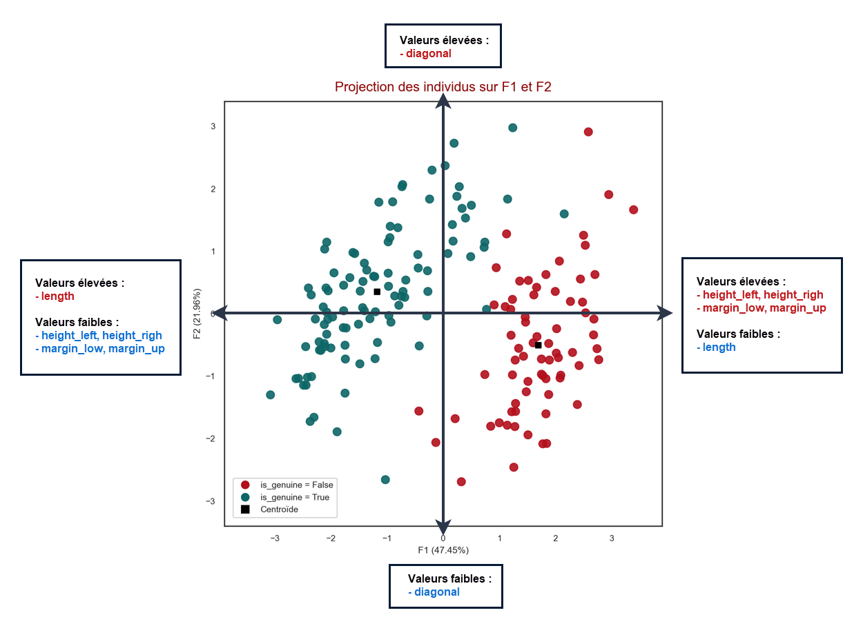
Grâce à ce graphique, on constate que les vrais billets sont différenciés des faux billets uniquement sur l'axe
1 :
--> en effet, on constate que quelle que soit la valeur de F2, on peut trouver une valeur de F1 qui
correspond à un vrai billet mais aussi une valeur de F1 qui correspond à un faux ;
--> à l'inverse, il est possible de trouver des valeurs de F1 pour lesquelles, quelle que soit la valeur de
F2, l'observation sera toujours un vrai billet (ou un faux)
Par exemple, si F1 = -1.5, tous les individus avec cette coordonnée sont des vrais billets
cont_ind_sorted_F1=apc_initiale['ctr_ind_sorted_facteur_1']
from acp_perso import acp_global
apc_initiale2=acp_global(
    df=data_apc,
    axis_ranks=[(0,1)],
    group='cluster',
    varSupp=data[['is_genuine']],
    widget=True,
    version_name='2_v_initiale_2',
    data_only=None,
    graph_only=True,
    graph_only_acp=True,
    labels_ind=True
)

| diagonal | height_left | height_right | margin_low | margin_up | length | |
|---|---|---|---|---|---|---|
| moyennes globales | 171.9406 | 104.0664 | 103.9281 | 4.6121 | 3.1704 | 112.5704 |
| moyennes vrais billets | 171.9761 | 103.9515 | 103.7759 | 4.1435 | 3.0555 | 113.2072 |
| moyennes faux billets | 171.8899 | 104.2304 | 104.1456 | 5.2816 | 3.3346 | 111.6607 |
Même logique que pour la qualité de représentation des variables :
-> on additionne le COS² des facteurs 1 et 2
---> plus la valeur est proche de 1, meilleure est la représentation de l'individu sur le 1er plan factoriel
from acp_perso import multi_table
print()
display(HTML('on récupère les COS² de notre fonction ACP'))
cos2_ind = apc_initiale['cos2_ind']
cos2_ind.sample(3)
print()
display(HTML('on additionne les cos² des 2 premiers facteurs : plus la valeur est proche de 1, meilleure est la représentation de l\'individu sur le premier plan'))
df_cos_ind = cos2_ind[['id', 'F1', 'F2']]
df_temp=cos2_ind.copy()
df_temp['qualite_1er_plan'] = df_cos_ind['F1'] + df_cos_ind['F2']
df_cos_ind=df_temp.copy()
df_cos_ind_q=df_cos_ind[['qualite_1er_plan']]
df_cos_ind_q.index.name="id_ind"
print()
display(HTML('On affiche les 10 individus les mieux représentés et les 10 individus les moins bien représentés'))
ind_plus = df_cos_ind_q.nlargest(10, 'qualite_1er_plan', keep='all')
ind_moins = df_cos_ind_q.nsmallest(10, 'qualite_1er_plan', keep='all')
display(multi_table([ind_plus, ind_moins], marg_r='4'))
| id | F1 | F2 | F3 | F4 | F5 | F6 | |
|---|---|---|---|---|---|---|---|
| 103 | 103 | 0.7710 | 0.0915 | 0.0022 | 0.0714 | 0.0241 | 0.0399 |
| 83 | 83 | 0.1265 | 0.5417 | 0.2868 | 0.0321 | 0.0085 | 0.0044 |
| 93 | 93 | 0.7395 | 0.1307 | 0.1230 | 0.0053 | 0.0009 | 0.0004 |
|
|
On affiche ces individus sur le graphique de projection des individus
ind_plus_i=ind_plus.index
ind_moins_i=ind_moins.index
from acp_perso import acp_global
apc_initiale3=acp_global(
    df=data_apc,
    group_special=ind_plus_i,
    group_special2=ind_moins_i,
    group_spe_name=['Représentation ++', 'Représentation --'],
    axis_ranks=[(0,1)],
    group='cluster',
    varSupp=data[['is_genuine']],
    widget=True,
    version_name='3_v_initiale_3',
    data_only=None,
    graph_only=True,
    graph_only_acp=True,
    labels_ind=True
)

| diagonal | height_left | height_right | margin_low | margin_up | length | |
|---|---|---|---|---|---|---|
| moyennes globales | 171.9406 | 104.0664 | 103.9281 | 4.6121 | 3.1704 | 112.5704 |
| moyennes vrais billets | 171.9761 | 103.9515 | 103.7759 | 4.1435 | 3.0555 | 113.2072 |
| moyennes faux billets | 171.8899 | 104.2304 | 104.1456 | 5.2816 | 3.3346 | 111.6607 |
On remarque que les individus les moins bien représentés sont ceux qui sont "à la frontière" des 2 groupes
Elles permettent de déterminer les individus qui pèsent le plus dans la définition de chaque facteur.
On regarde quels sont les individus qui sont les plus contributifs et ce, pour les différents axes (on regardera
aussi si des individus ne contribuent pas de manière excessive à la formation d'un axe)
from acp_perso import multi_table
ctr_ind=apc_initiale['contribution_ind']

ctr_ind_f1 = ctr_ind.loc[:, ['F1']].sort_values(by='F1', ascending=False)
ctr_ind_f1.index.name='id_ind'
ctr_ind_f1_10 = ctr_ind_f1.head(10)
ctr_ind_f1_10.F1 = ctr_ind_f1_10.F1.apply(lambda x: str(round(100*x,2))+'%')

ctr_ind_f2 = ctr_ind.loc[:, ['F2']].sort_values(by='F2', ascending=False)
ctr_ind_f2.index.name='id_ind'
ctr_ind_f2_10 = ctr_ind_f2.head(10)
ctr_ind_f2_10.F2 = ctr_ind_f2_10.F2.apply(lambda x: str(round(100*x,2))+'%')

display(multi_table([ctr_ind_f1_10, ctr_ind_f2_10], marg_r='4'))
|
|
ctr_ind_f1_i=ctr_ind_f1.index[:10]
ctr_ind_f2_i=ctr_ind_f2.index[:10]
from acp_perso import acp_global
apc_initiale4=acp_global(
    df=data_apc,
    group_special=ctr_ind_f1_i,
    group_special2=ctr_ind_f2_i,
    group_spe_name=['Contributeurs F1', 'Contributeurs F2'],
    axis_ranks=[(0,1)],
    group='cluster',
    varSupp=data[['is_genuine']],
    widget=True,
    version_name='4_v_initiale_4',
    data_only=None,
    graph_only=True,
    graph_only_acp=True,
    labels_ind=True
)

| diagonal | height_left | height_right | margin_low | margin_up | length | |
|---|---|---|---|---|---|---|
| moyennes globales | 171.9406 | 104.0664 | 103.9281 | 4.6121 | 3.1704 | 112.5704 |
| moyennes vrais billets | 171.9761 | 103.9515 | 103.7759 | 4.1435 | 3.0555 | 113.2072 |
| moyennes faux billets | 171.8899 | 104.2304 | 104.1456 | 5.2816 | 3.3346 | 111.6607 |
On va appliquer un algorithme de classification sur nos données initiales, sans prendre en compte la variable
is_genuine
Le but est ici de vérifier que les groupes 'faux billets' et 'vrais billets' sont bien des groupes différents
composés d'individus possédant des caractéristiques similaires
On choisi le K-means comme méthode d’apprentissage non supervisé
from sklearn import preprocessing
from sklearn.cluster import KMeans

data_kmeans = data.copy()
data_kmeans = data_kmeans.drop(columns=['cluster', 'is_genuine'])
X = data_kmeans.values
std_scale = preprocessing.StandardScaler().fit(X)
X_scaled = std_scale.transform(X)

Sum_of_squared_distances = []
K = range(1,15)
for k in K:
    km = KMeans(n_clusters=k)
    km = km.fit(X_scaled)
    Sum_of_squared_distances.append(km.inertia_)

plt.plot(K, Sum_of_squared_distances, 'bx-')
plt.xlabel('k')
plt.ylabel('Somme des distances au carré')
plt.title('Elbow Methode - Trouver k optimal')
plt.savefig('data/exports/img_charts/6.k_optimal_kmeans.png', dpi = 300)
plt.show();

On va se limiter à 2 dimensions, donc au premier plan factoriel
km = KMeans(n_clusters=2)
km = km.fit(X_scaled)
clusters = km.labels_
data_new=data_kmeans.copy()
data_new['clusters']=clusters
resultat_acp_kmeans=acp_global(df=data_new,
                            axis_ranks=[(0,1)],
                            group='clusters',
                            varSupp=None,
                            widget=True,
                            labels_ind=None,
                            version_name='5_v_kmeans_1',
                            graph_only=True,
                            graph_only_acp=True,
                            name_groups=['groupe 1', 'groupe 2'],
                            palette_color = ["#4ed147", "#d17e1a", "#2bb6b6", "#514a39"])

On va analyser la partition :
--> on va comparer les groupes obtenus par le kmeans avec les groupes initiaux de vrais et faux billets
# indices des groupes initiaux vrais et faux billets
vrais_billets_ind = data[data['is_genuine'] == True].index
faux_billets_ind = data[data['is_genuine'] == False].index

group_test=data_new[data_new['clusters'] == 1].index
# différencier les cas où groupe1 du kmeans correpond aux vrais billets...
if 18 in group_test:
    data_new['cluster']=data_new['clusters']
# ... des cas où groupe1 du kmeans correpond aux faux billets
else:
    data_new['cluster']=data_new['clusters'].apply(lambda x: (x-1 if x==1 else x+1))

# indices des groupes obtenus suite au kmeans
groupe_0_kmeans = data_new[data_new['cluster'] == 0].index
groupe_1_kmeans = data_new[data_new['cluster'] == 1].index
original_value = set(vrais_billets_ind)
kmeans_value = set(groupe_1_kmeans)

a = original_value - kmeans_value
a_str=('-'.join([str(n) for n in a]) if len(a) !=0 else 'aucun élément')
b = kmeans_value - original_value

b_str=('-'.join([str(n) for n in set(b)]) if len(b) !=0 else 'aucun élément')


x=("s" if len(a) > 1 else "")
print(f"- Indice"+x+""+(" du" if len(a) < 2 else " des")+" vrai"+x+" billet"+x+" interprété"+x+" comme 'faux billet"+x+"' par le kmeans : " + a_str)
print(f"    -> soit {len(a)} faux négatif"+x)
y=("s" if len(b) > 1 else "")
print(f"- Indice"+y+""+(" du" if len(b) < 2 else " des")+" faux billet"+y+" interprété"+y+" comme 'vrai"+y+" billet"+y+"' par le kmeans : " + b_str)
print(f"    -> soit {len(b)} faux positif"+y)
- Indices des vrais billets interprétés comme 'faux billets' par le kmeans : 0-65-96-5-69-9-10-84
    -> soit 8 faux négatifs
- Indice du faux billet interprété comme 'vrai billet' par le kmeans : 144
    -> soit 1 faux positif
from acp_perso import acp_global
var=var_actives
var.append('cluster')
resultat_acp_kmeans2=acp_global(
    df=data_new[var],
    group_special=list(a),
    group_special2=list(b),
    group_spe_name=['Faux-Négatifs', 'Faux-Positifs'],
    axis_ranks=[(0,1)],
    group='cluster',
    varSupp=None,
    widget=True,
    version_name='6_v_kmeans_2',
    data_only=None,
    graph_only=True,
    graph_only_acp=True,
    labels_ind=True
)

| diagonal | height_left | height_right | margin_low | margin_up | length | cluster | |
|---|---|---|---|---|---|---|---|
| moyennes globales | 171.9406 | 104.0664 | 103.9281 | 4.6121 | 3.1704 | 112.5704 | 0.5471 |
| moyennes vrais billets | 171.9568 | 103.9072 | 103.7312 | 4.1392 | 3.0451 | 113.2403 | 1.0000 |
| moyennes faux billets | 171.9210 | 104.2586 | 104.1660 | 5.1832 | 3.3218 | 111.7613 | 0.0000 |
from sklearn.metrics import confusion_matrix

y_true = data_apc['cluster']
y_pred = data_new['cluster']

cf_matrix = confusion_matrix(y_true, y_pred)
cf_matrix
array([[69,  1],
       [ 8, 92]], dtype=int64)
tn, fp, fn, tp = confusion_matrix(y_true, y_pred).ravel()
print("Vrais Négatifs (True Negatives) : ",tn)
print("Faux Positifs (False Positives) : ",fp)
print("Faux Négatifs (False Negatives) : ",fn)
print("Vrais Positifs (True Positives) : ",tp)
Vrais Négatifs (True Negatives) :  69
Faux Positifs (False Positives) :  1
Faux Négatifs (False Negatives) :  8
Vrais Positifs (True Positives) :  92
from fonctions_perso import heatmap_matrice_confusion
heatmap_matrice_confusion(cf_matrix, num_graph=7)

On peut déduire de cette matrice différents critères de performances en fonction de l'objectif
recherché:
${\scriptstyle Sensibilite}=\frac{TP}{TP+FN}$ (sensibilité ou rappel)
${\scriptstyle Precision}=\frac{TP}{TP+FP}$
${\scriptstyle F-mesure}={\scriptstyle F1 score}=2×\frac{Precision×Sensibilite}{Precision+Sensibilite}=\frac{2TP}{2TP+FP+FN}$
${\scriptstyle Specificite}=\frac{TN}{TN+FP}$
from sklearn.metrics import classification_report

target_names = ['Faux_billets', 'Vrais Billets']
print(classification_report(y_true, y_pred, target_names=target_names))
               precision    recall  f1-score   support

 Faux_billets       0.90      0.99      0.94        70
Vrais Billets       0.99      0.92      0.95       100

     accuracy                           0.95       170
    macro avg       0.94      0.95      0.95       170
 weighted avg       0.95      0.95      0.95       170
from acp_perso import acp_global
apc_initiale5=acp_global(
    df=data_apc,
    group_special=ctr_ind_f1_i,
    group_special2=ctr_ind_f2_i,
    group_spe_name='ctr',
    axis_ranks=[(0,1),(2,3),(4,5)],
    group='cluster',
    varSupp=data[['is_genuine']],
    widget=True,
    version_name='0-centro',
    data_only=True
)
Traitement terminé
Les différents tests de vérification sont positifs : pas de problème détecté
centroid_plan_1 = apc_initiale5["centroides_1_2"]
centroid_plan_2 = apc_initiale5["centroides_3_4"]
centroid_plan_3 = apc_initiale5["centroides_5_6"]
for i in range(5):
    data_cent = {
        'is_genuine': ["False","True"],
        'd1': centroid_plan_1[0],
        'd2': centroid_plan_1[1],
        'd3': centroid_plan_2[0],
        'd4': centroid_plan_2[1],
        'd5': centroid_plan_3[0],
        'd6': centroid_plan_3[1],
    }
df_centroids = pd.DataFrame(data_cent, columns=['is_genuine', 'd1', 'd2', 'd3', 'd4', 'd5', 'd6'])
df_centroids
| is_genuine | d1 | d2 | d3 | d4 | d5 | d6 | |
|---|---|---|---|---|---|---|---|
| 0 | False | 1.6914 | -0.5026 | -0.0229 | -0.1396 | -0.0706 | 0.0444 |
| 1 | True | -1.1840 | 0.3518 | 0.0161 | 0.0977 | 0.0494 | -0.0311 |
init_kmeans=df_centroids.drop(columns='is_genuine').values
init_kmeans
array([[ 1.69137433, -0.50257104, -0.02294236, -0.13957373, -0.07062729,
         0.04439788],
       [-1.18396203,  0.35179973,  0.01605965,  0.09770161,  0.0494391 ,
        -0.03107852]])
from sklearn.decomposition import PCA

data_new2=data_kmeans.copy()

Xc = data_new2.values
std_scale_c = preprocessing.StandardScaler().fit(Xc)
X_scaled_c = std_scale_c.transform(Xc)

#pca = PCA(n_components=2).fit(data_new2)
km = KMeans(n_clusters=2, init=init_kmeans, n_init=1)
km = km.fit(X_scaled_c)

data_new2['clusters']=km.labels_
resultat_acp_kmeans_init_cent=acp_global(df=data_new2,
                            axis_ranks=[(0,1)],
                            group='clusters',
                            varSupp=None,
                            widget=True,
                            labels_ind=True,
                            version_name='7_v_kmeans_init_centroid',
                            graph_only=True,
                            graph_only_acp=True,
                            name_groups=['groupe 1', 'groupe 2'],
                            palette_color = ["#2bb6b6", "#514a39", "#4ed147", "#d17e1a"])

| diagonal | height_left | height_right | margin_low | margin_up | length | clusters | |
|---|---|---|---|---|---|---|---|
| moyennes globales | 171.9406 | 104.0664 | 103.9281 | 4.6121 | 3.1704 | 112.5704 | 0.4471 |
| moyennes groupe 1 | 171.9164 | 104.2582 | 104.1653 | 5.2003 | 3.3191 | 111.7384 | 1.0000 |
| moyennes groupe 2 | 171.9601 | 103.9113 | 103.7364 | 4.1366 | 3.0502 | 113.2431 | 0.0000 |
group_test_c=data_new2[data_new2['clusters'] == 1].index

# différencier les cas où groupe1 du kmeans correpond aux vrais billets...
if 18 in group_test_c:
    data_new2['cluster']=data_new2['clusters']
# ... des cas où groupe1 du kmeans correpond aux faux billets
else:
    data_new2['cluster']=data_new2['clusters'].apply(lambda x: (x-1 if x==1 else x+1))

y_true_c = data_apc['cluster']
y_pred_c = data_new2['cluster']

cf_matrix_c = confusion_matrix(y_true_c, y_pred_c)
heatmap_matrice_confusion(cf_matrix_c, num_graph=8)

target_names = ['Faux_billets', 'Vrais Billets']
print(classification_report(y_true_c, y_pred_c, target_names=target_names))
               precision    recall  f1-score   support

 Faux_billets       0.91      0.99      0.95        70
Vrais Billets       0.99      0.93      0.96       100

     accuracy                           0.95       170
    macro avg       0.95      0.96      0.95       170
 weighted avg       0.96      0.95      0.95       170
# indices des groupes obtenus suite au kmeans
groupe_0_kmeans_c = data_new2[data_new2['cluster'] == 0].index
groupe_1_kmeans_c = data_new2[data_new2['cluster'] == 1].index

original_value_c = set(vrais_billets_ind)
kmeans_value_c = set(groupe_1_kmeans_c)

ac = original_value_c - kmeans_value_c
ac_str=('-'.join([str(n) for n in ac])+' (soit '+str(len(ac))+' élément'+('s' if len(ac)!=1 else '')+')' if len(ac) !=0 else 'aucun élément')
bc = kmeans_value_c - original_value_c
bc_str=('-'.join([str(n) for n in bc])+' (soit '+str(len(bc))+' élément'+('s' if len(bc)!=1 else '')+')' if len(bc) !=0 else 'aucun élément')

display(HTML("Indices des 'vrais billets' interprêtés comme 'faux billets' par le kmeans : " + ac_str))
display(HTML("Indices des 'faux billets' interprêtés comme 'vrais billets' par le kmeans : " + bc_str))
L'objectif est ici de construire un modèle qui permette de prédire si un billet est vrai ou faux à partir de ses caractéristiques géométriques (cf. les variables explicatives)
On va utiliser le module scikit-learn de Python
data_reg=data.drop(columns='cluster')
data_reg.sample(3)
| is_genuine | diagonal | height_left | height_right | margin_low | margin_up | length | |
|---|---|---|---|---|---|---|---|
| 68 | 1 | 172.0500 | 103.7200 | 103.8100 | 4.2100 | 2.9700 | 113.6100 |
| 163 | 0 | 171.7800 | 104.0700 | 104.1600 | 5.7700 | 3.3000 | 111.2700 |
| 63 | 1 | 171.6500 | 103.9500 | 103.6100 | 4.0300 | 3.2500 | 113.0600 |
# variables explicatives
x_cols = ['length', 'height_left', 'height_right', 'margin_low', 'margin_up', 'diagonal']

# variable cible
y_col = 'is_genuine'

# df variables explicatives
X = data_reg[x_cols]

# df variable cible
y = data_reg[[y_col]]
X.dtypes
y.dtypes
length          float64
height_left     float64
height_right    float64
margin_low      float64
margin_up       float64
diagonal        float64
dtype: object
is_genuine    int64
dtype: object
from sklearn.model_selection import train_test_split

# partition aléatoire du jeu de données en 75% pour créer le modèle, 25% pour tester le modèle
X_train, X_test, y_train, y_test = train_test_split(X, y, test_size=0.25, stratify = y, random_state=23)
def modalites_y(y):
    nb_true = y.value_counts()[1]
    part_true = nb_true /y.shape[0]*100
    nb_false = y.value_counts()[0]
    part_false = nb_false / y.shape[0]*100
    print(f"      * {nb_true} vrais billets, soit {part_true:.2f}%")
    print(f"      * {nb_false} faux billets, soit {part_false:.2f}%")

print("Nos données ont été splitées en 2 échantillons :")
print()
print(f"  - un échantillon d'entrainement ({int(0.75*data_reg.shape[0])} billets, soit 75% des données initiales), avec la répartion suivante :")
modalites_y(y_train)
print()
print(f"  - un échantillon de test ({int(0.25*data_reg.shape[0])+1} billets, soit 25% des données initiales), avec la répartion suivante :")
modalites_y(y_test)
Nos données ont été splitées en 2 échantillons :

  - un échantillon d'entrainement (127 billets, soit 75% des données initiales), avec la répartion suivante :
      * 75 vrais billets, soit 59.06%
      * 52 faux billets, soit 40.94%

  - un échantillon de test (43 billets, soit 25% des données initiales), avec la répartion suivante :
      * 25 vrais billets, soit 58.14%
      * 18 faux billets, soit 41.86%
from sklearn import linear_model

# instanciation du modele
logreg=linear_model.LogisticRegression()

# entrainement du modèle
logreg.fit(X_train,np.ravel(y_train))

# affichage des coefficients
df_coef = pd.DataFrame({"var":X_train.columns,"coef":logreg.coef_[0]})
df_coef

# affichage de la constante
const = logreg.intercept_[0]
print(f"Constante : {const}")
LogisticRegression()
| var | coef | |
|---|---|---|
| 0 | length | 1.9521 |
| 1 | height_left | -0.6296 |
| 2 | height_right | -1.0345 |
| 3 | margin_low | -2.7213 |
| 4 | margin_up | -0.9576 |
| 5 | diagonal | -0.1765 |
Constante : -0.012294057430843172
# stockages de prédictions
y_pred = logreg.predict(X_test)
from fonctions_perso import heatmap_matrice_confusion

# on affiche la matrice de confusion
conf_mat_reg = confusion_matrix(y_test, y_pred)
conf_mat_reg
heatmap_matrice_confusion(conf_mat_reg, num_graph=9)
array([[17,  1],
       [ 0, 25]], dtype=int64)

y_reel_pred = y_test.copy()
y_reel_pred['prediction']=y_pred
y_reel_pred['indice']=y_reel_pred.index
y_reel_pred.sample(2)
| is_genuine | prediction | indice | |
|---|---|---|---|
| 11 | 1 | 1 | 11 |
| 1 | 1 | 1 | 1 |
FN_ind=[]
FP_ind=[]
for i in range(y_reel_pred.shape[0]):
    v_reelle = y_reel_pred.iloc[i,0]
    v_pred = y_reel_pred.iloc[i,1]
    if v_reelle > v_pred:
        FN_ind.append(y_reel_pred.iloc[i,2])
    if v_reelle < v_pred:
        FP_ind.append(y_reel_pred.iloc[i,2])

if len(FN_ind) != 0:
    a=FN_ind
    a_str='-'.join([str(n) for n in a])
    print("Présence de "+str(len(FN_ind))+" Faux Négatif"+("s" if len(FN_ind)>1 else "")+" (indice"+("s" if len(FN_ind)>1 else "")+ " " +a_str +")")
if len(FP_ind) != 0:
    b=FP_ind
    b_str='-'.join([str(n) for n in b])
    print("Présence de "+str(len(FP_ind))+" Faux Positif"+("s" if len(FP_ind)>1 else "")+" (indice"+("s" if len(FP_ind)>1 else "")+ " " +b_str +")")
Présence de 1 Faux Positif (indice 102)
# on affiche les mesures des performances
target_names = ['Faux_billets', 'Vrais Billets']
print(classification_report(y_test, y_pred, target_names=target_names))
               precision    recall  f1-score   support

 Faux_billets       1.00      0.94      0.97        18
Vrais Billets       0.96      1.00      0.98        25

     accuracy                           0.98        43
    macro avg       0.98      0.97      0.98        43
 weighted avg       0.98      0.98      0.98        43
from sklearn import metrics

print('Les données du modèle sont les suivantes :')
# accuracy: (tp + tn) / (p + n)
accuracy = metrics.accuracy_score(y_test, y_pred)
print('   - Score : %f' % accuracy)
# precision tp / (tp + fp)
precision = metrics.precision_score(y_test, y_pred)
print('   - Précision : %f' % precision)
# recall: tp / (tp + fn)
recall = metrics.recall_score(y_test, y_pred)
print('   - Sensibilité (rappel) : %f' % recall)
# f1: 2 tp / (2 tp + fp + fn)
f1 = metrics.f1_score(y_test, y_pred)
print('   - F1 score : %f' % f1)
Les données du modèle sont les suivantes :
   - Score : 0.976744
   - Précision : 0.961538
   - Sensibilité (rappel) : 1.000000
   - F1 score : 0.980392
# probabilités associées aux prédictions
proba_pred = logreg.predict_proba(X_test)

# on affiche les 5 premiers éléments
proba_pred[:5]
array([[0.84972937, 0.15027063],
       [0.01002712, 0.98997288],
       [0.93793928, 0.06206072],
       [0.00879464, 0.99120536],
       [0.3911693 , 0.6088307 ]])
# on récupère les probabilites de 'is_genuine' = 1 (donc proba associée à un vrai billet)
proba_vrai_billet=logreg.predict_proba(X_test)[:,1]

# on crée un df avec pour colonnes : 'index du billet' et 'proba que ce soit un vrai billet'
df_true=pd.DataFrame({'index_billet':X_test.index, 'proba_vrai_billet':proba_vrai_billet})

# on affiche un random de 4 billets de df_true
df_true.sample(4)
| index_billet | proba_vrai_billet | |
|---|---|---|
| 34 | 140 | 0.0433 |
| 26 | 154 | 0.0121 |
| 25 | 131 | 0.0037 |
| 3 | 89 | 0.9912 |
# on met en index de df_true la colonne 'index_billet'
df_true_ind = df_true.set_index('index_billet')
df_true_ind.sample(1)
| proba_vrai_billet | |
|---|---|
| index_billet | |
| 131 | 0.0037 |
# on merge le df_true_ind avec le df initial
df_temp = data_reg.copy()
df_proba_vrai_billet = pd.merge(df_temp, df_true_ind, left_index=True, right_index=True)
df_proba_vrai_billet['index_billets']=df_proba_vrai_billet.index
df_proba_vrai_billet=df_proba_vrai_billet.reset_index(drop=True)
df_proba_vrai_billet.shape
df_proba_vrai_billet.sample(3)
(43, 9)
| is_genuine | diagonal | height_left | height_right | margin_low | margin_up | length | proba_vrai_billet | index_billets | |
|---|---|---|---|---|---|---|---|---|---|
| 19 | 1 | 172.5300 | 103.9900 | 103.5500 | 4.5000 | 3.1000 | 113.0300 | 0.9140 | 56 |
| 14 | 1 | 171.1300 | 104.2800 | 103.1400 | 4.1600 | 2.9200 | 113.0000 | 0.9800 | 39 |
| 27 | 0 | 171.9900 | 104.1800 | 104.2000 | 5.2600 | 3.2300 | 111.8300 | 0.0537 | 105 |
proba_fn_102 = df_proba_vrai_billet[df_proba_vrai_billet['index_billets'] == 102]
proba_fn_102
| is_genuine | diagonal | height_left | height_right | margin_low | margin_up | length | proba_vrai_billet | index_billets | |
|---|---|---|---|---|---|---|---|---|---|
| 26 | 0 | 171.9400 | 104.2100 | 104.1000 | 4.2800 | 3.4700 | 112.2300 | 0.6088 | 102 |
Définition courbe ROC :
->Une courbe ROC (Receiver Operating Characteristic) est un graphique représentant les performances d'un
classificateur binaire.
Cette courbe trace le taux de vrais positifs en fonction du taux de faux positifs :
def plot_roc_curve(fpr, tpr):
    auc = metrics.roc_auc_score(y_test, y_pred_proba)
    plt.figure(figsize=(6,6))
    plt.title('ROC Curve')
    plt.plot(fpr, tpr, linewidth=3, label="auc="+str(round(auc,4)))
    plt.plot([0, 1], [0, 1], 'k--')
    plt.axis([-0.005, 1, 0, 1.005])
    plt.xticks(np.arange(0,1, 0.05), rotation=90)
    plt.xlabel("Spécificité : Taux de FP (Faux Positifs)")
    plt.ylabel("Sensibilité : Taux de TP (Vrais Positifs)")
    plt.legend(loc='best')
    plt.savefig('data/exports/img_charts/10.courbe_roc_regression_logistique.png', dpi = 300)
    plt.show()
y_pred_proba = proba_pred[::,1]
fpr, tpr, _ = metrics.roc_curve(y_test, y_pred_proba)
plot_roc_curve(fpr, tpr)

# instanciation du modèle
lr = linear_model.LogisticRegression(solver="liblinear")

# exécution de l'instance sur la totalité des données (X,y)
modele_all = lr.fit(X,np.ravel(y))

# affichage des coef et de la constante
print(modele_all.coef_, modele_all.intercept_)
[[ 2.2195641 -0.57102422 -1.02979861 -2.81603217 -1.49138411 -0.37753486]] [-0.0065148]
# utilisation du module model_selection
from sklearn import model_selection

# évaluation en modèle croisé : 10 cross-validation
success = model_selection.cross_val_score(lr, X, np.ravel(y), cv=10, scoring='accuracy')

# détail des itérations : taux de succès de chaque itération
success
array([0.94117647, 1.        , 0.94117647, 1.        , 1.        ,
       1.        , 0.94117647, 1.        , 1.        , 1.        ])
La moyenne des taux de succès de chaque itération correspond au taux de succès général du modèle
tx_succes_cv = success.mean()
tx_succes_cv
0.9823529411764707
# variables initiales
X_train.columns

# instanciation du modèle
lr_lim = linear_model.LogisticRegression(solver="liblinear")

# algo de sélection des variables
from sklearn.feature_selection import RFE
selecteur = RFE(estimator=lr_lim)

# on lance la recherche
sol = selecteur.fit(X_train, np.ravel(y_train))

# nombre de variables sélectionnées
sol.n_features_ = 3

# liste des variables conservées
var_cons=[]
for i,x in enumerate(X_train.columns):
    if sol.support_[i] == True:
        var_cons.append(x)
print("Les variables conservées sont les suivantes : "+ ", ".join(var_cons))
print()

# ordre de suppresseion
nb_suppr = len(X_train.columns) - sol.n_features_
sup_order={}
for i,x in enumerate(X_train.columns):
    if sol.ranking_[i] > 1:
        sup_order[sol.ranking_[i]]=x
print("Les variables sont supprimées dans l'ordre suivant :")
for i,k in zip(range(nb_suppr), sorted(sup_order.keys(), reverse=True)):
    print(f"   - {i+1} : {sup_order[k]}")
Index(['length', 'height_left', 'height_right', 'margin_low', 'margin_up',
       'diagonal'],
      dtype='object')
Les variables conservées sont les suivantes : length, height_right, margin_low

Les variables sont supprimées dans l'ordre suivant :
   - 1 : diagonal
   - 2 : height_left
   - 3 : margin_up
#réduction de la base d'apprentissage aux variables sélectionnées
X_new_train = X_train[var_cons]

# construction du modèle sur les explicatives sélectionnées
modele_sel = lr.fit(X_new_train, np.ravel(y_train))

# réduction de la base de test aux variables sélectionnées
X_new_test = X_test[var_cons]

# prédiction du modèle
y_pred_sel = modele_sel.predict(X_new_test)

#évaluation
metrics.accuracy_score(y_test, y_pred_sel)
0.9534883720930233
Le score obtenu en réduisant nos variables de moitié reste très élevé
def auc_v(variables, target, df):
    X = df[variables]
    y = df[target]
    X_train, X_test, y_train, y_test = train_test_split(X, y, test_size=0.25, stratify = y, random_state=24)
    logreg = linear_model.LogisticRegression(solver='liblinear')
    logreg.fit(X_train, np.ravel(y_train))
    predictions = logreg.predict_proba(X_test)[::,1]
    auc = metrics.roc_auc_score(y_test, predictions)
    return auc
res_auc ={}
for i in x_cols:
    auc=auc_v([i], ['is_genuine'], data_reg)
    res_auc[i]=round(auc,4)
res_auc
{'length': 0.9267,
 'height_left': 0.1722,
 'height_right': 0.1033,
 'margin_low': 0.9433,
 'margin_up': 0.76,
 'diagonal': 0.6278}
En ne sélectionnant qu'une seule variable (length ou margin_low), on obtient une AUC
supérieure à 0.9
Testons le modèle en sélectionnant ces 2 variables
auc_v(['length', 'margin_low'], ['is_genuine'], data_reg)
0.9577777777777778
L'auc est proche de 0.96 en ne sélectionnant que ces 2 variables
Le principe :
Veuillez vous rendre sur la page suivante pour uploader votre fichier csv et visualiser directement les
résultats :
page de test